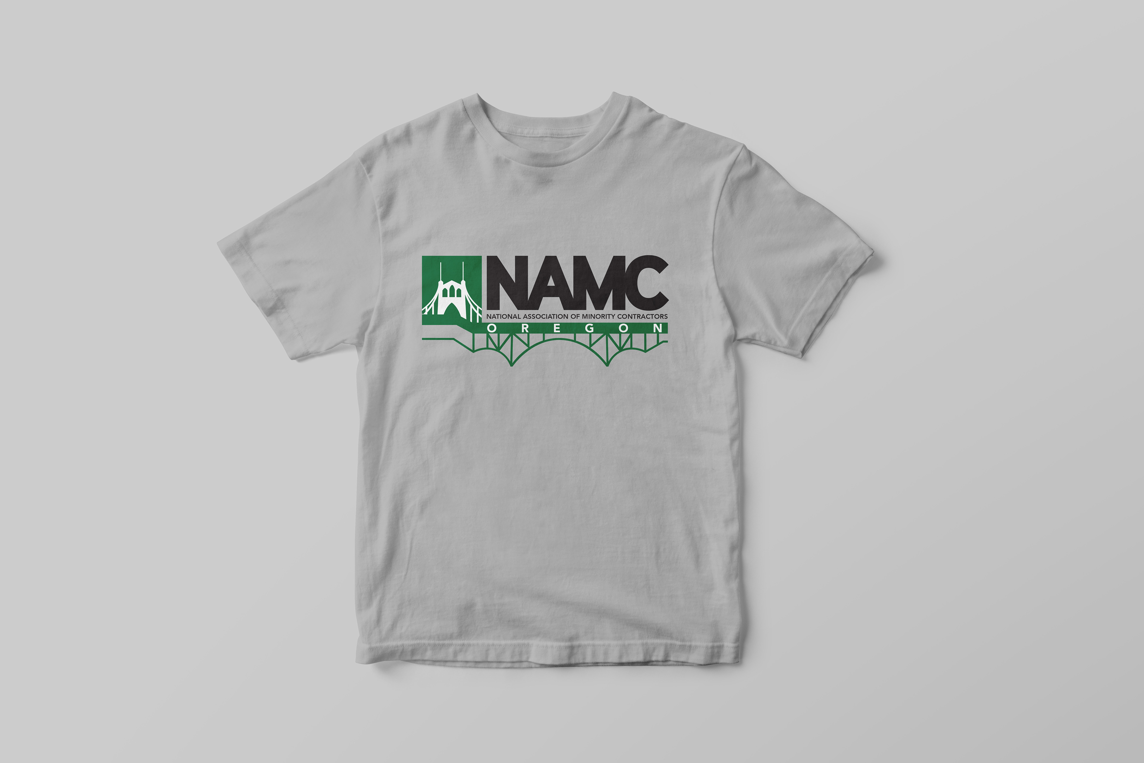
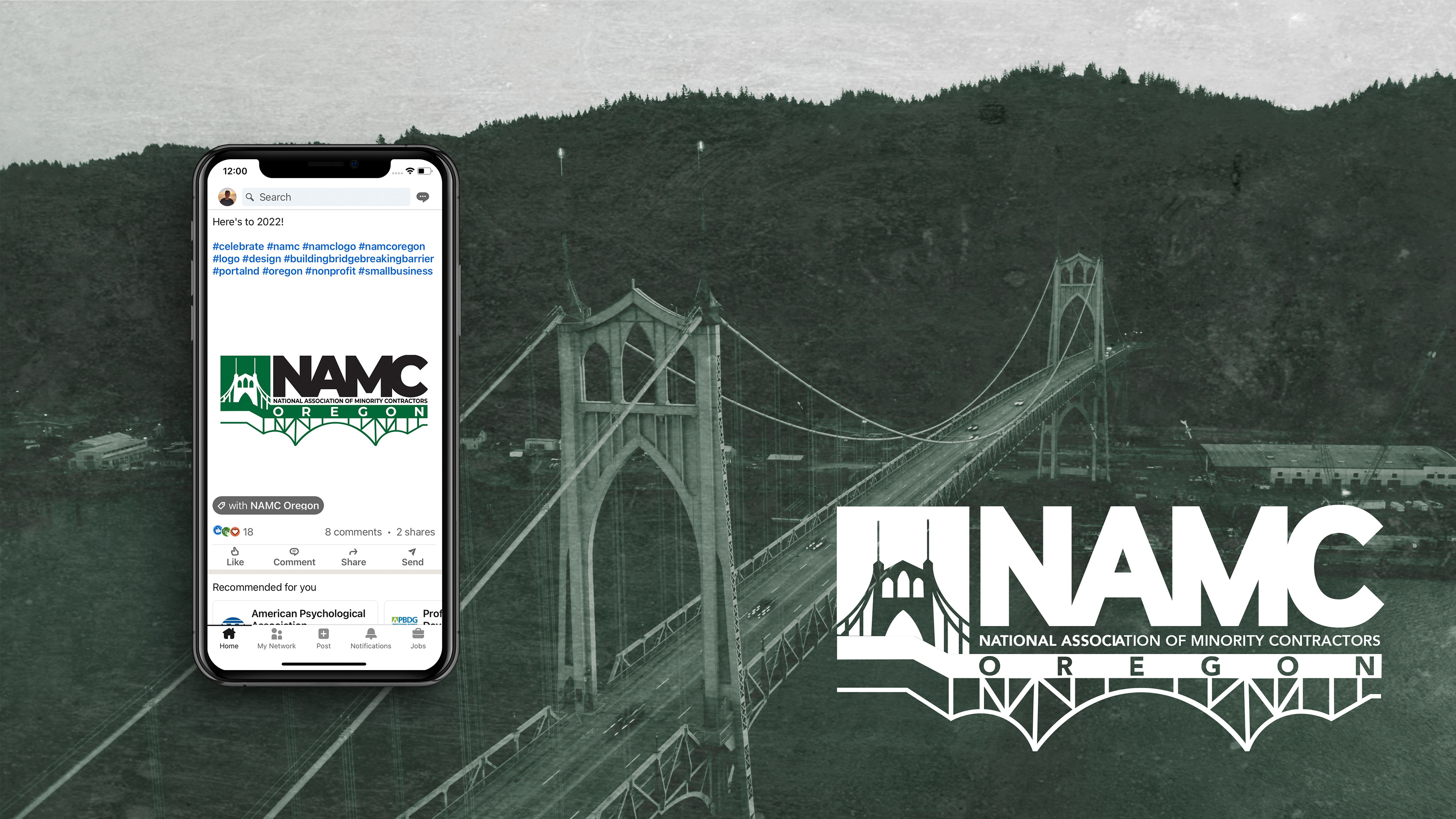
In Fall of 2021, the Marketing Director for NAMC-OR (National Association of Minority Contractors, Oregon) reached out to me to help them "refresh" their Logo to be more modern, and closer to their core message and values. It was an honor work on this project. In this section, I feature mock-ups of the new Logo I created for them, an example of the former Logo, and images showing some of the ways in which they have used their new logo in their marketing materials.
*The following is an image of the former NAMC-OR logo*
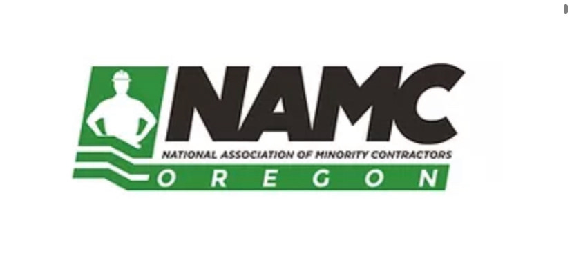
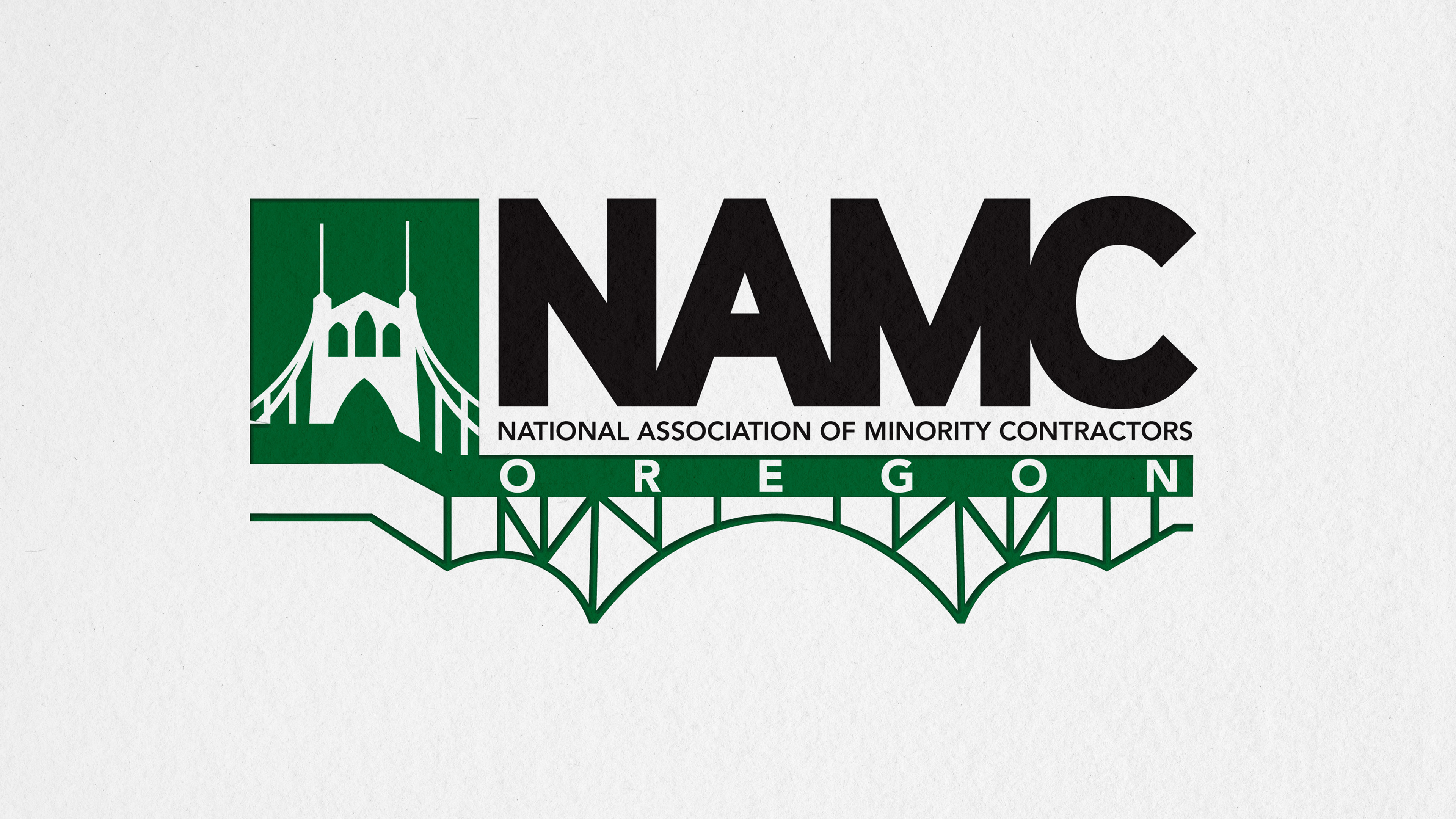
It was easy for me to identify issues with the former logo right off the bat. Most plainly, it was not indicative of their mission statement, nor was it representative of their community. The white silhouette of a male construction worker just was not communicating the heart and soul of their work. I set out to design something true to their mission statement: "Building Bridges, Crossing Barriers." I worked under the creative review of Nashoni Whitlock (Marketing Director) and Molly Washington (Chief Operating Officer) to create a logo that would not only fit their wants and needs, but also receive approval from the board of the National Affiliate. The answer, ultimately, was updated Typography, Color Palette, and a new form of Iconography for the Logo- which, after deep research and experimentation, I decided would be a favorite in the PNW… The St. John's Bridge in Cathedral Park, Portland, OR.