This is a student project from DES320-Information Graphics at PSUGD.
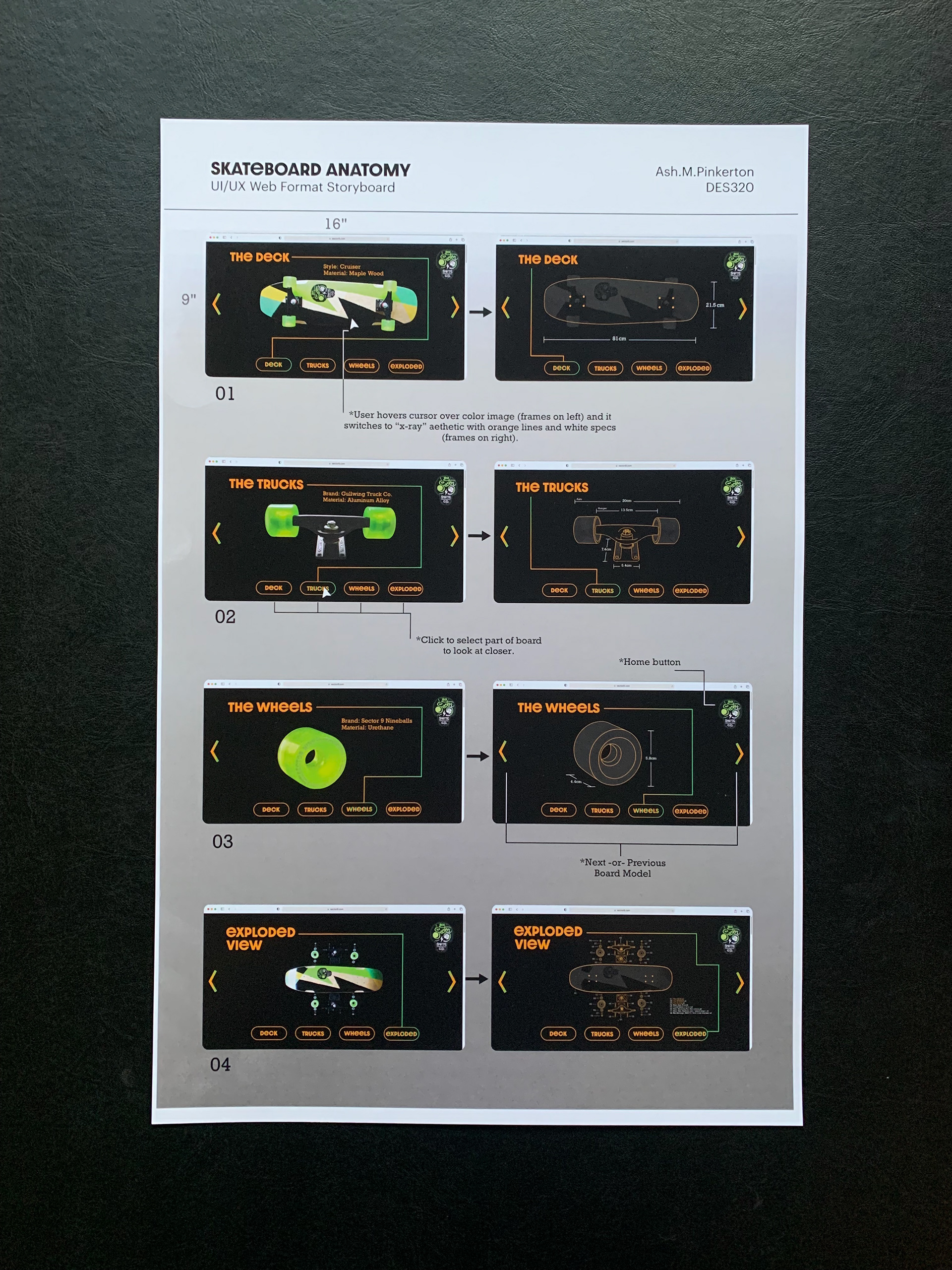
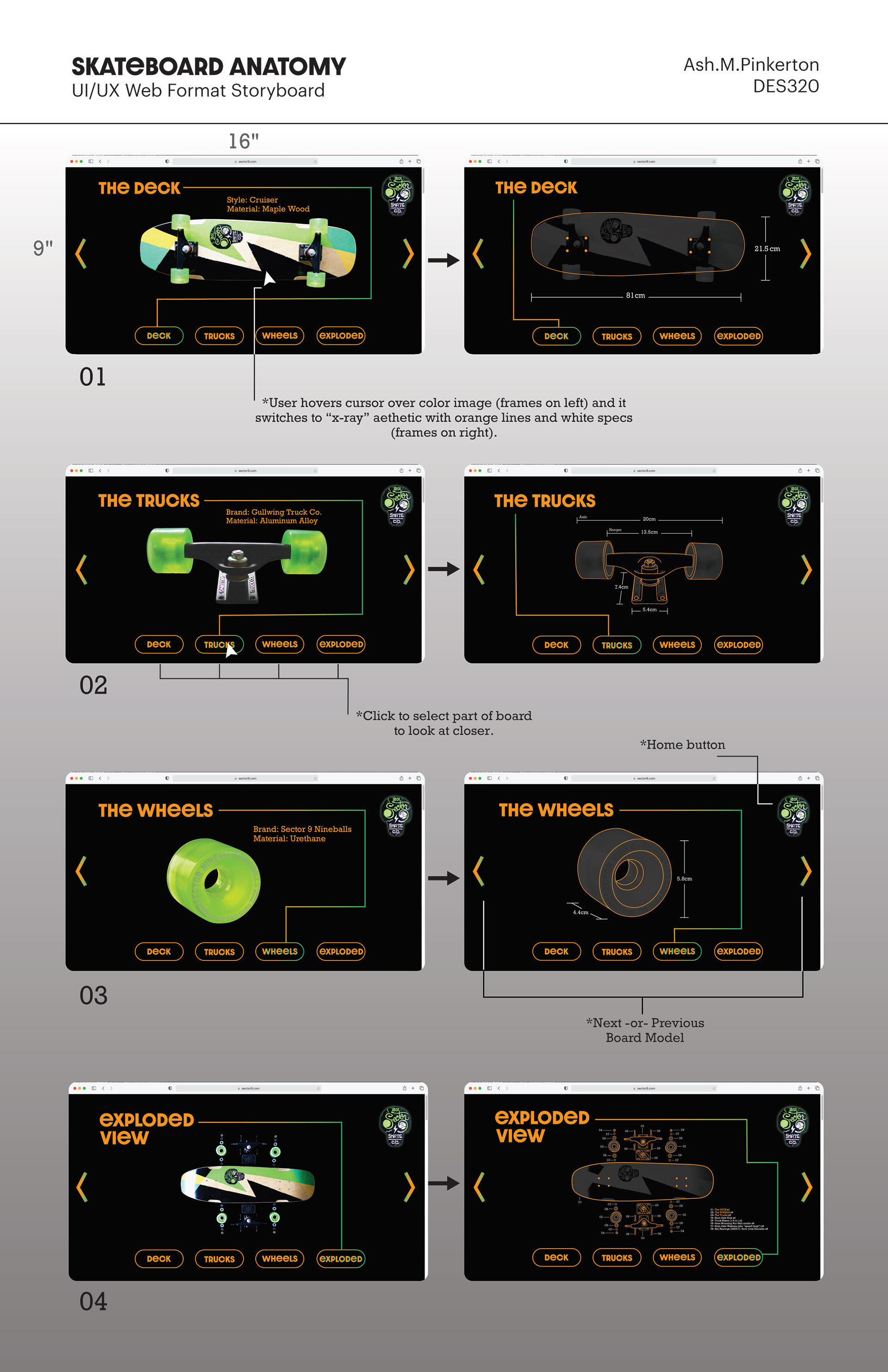
My vision for this project was dual-format from the start. I wanted to create print posters that would correspond with a website interface.
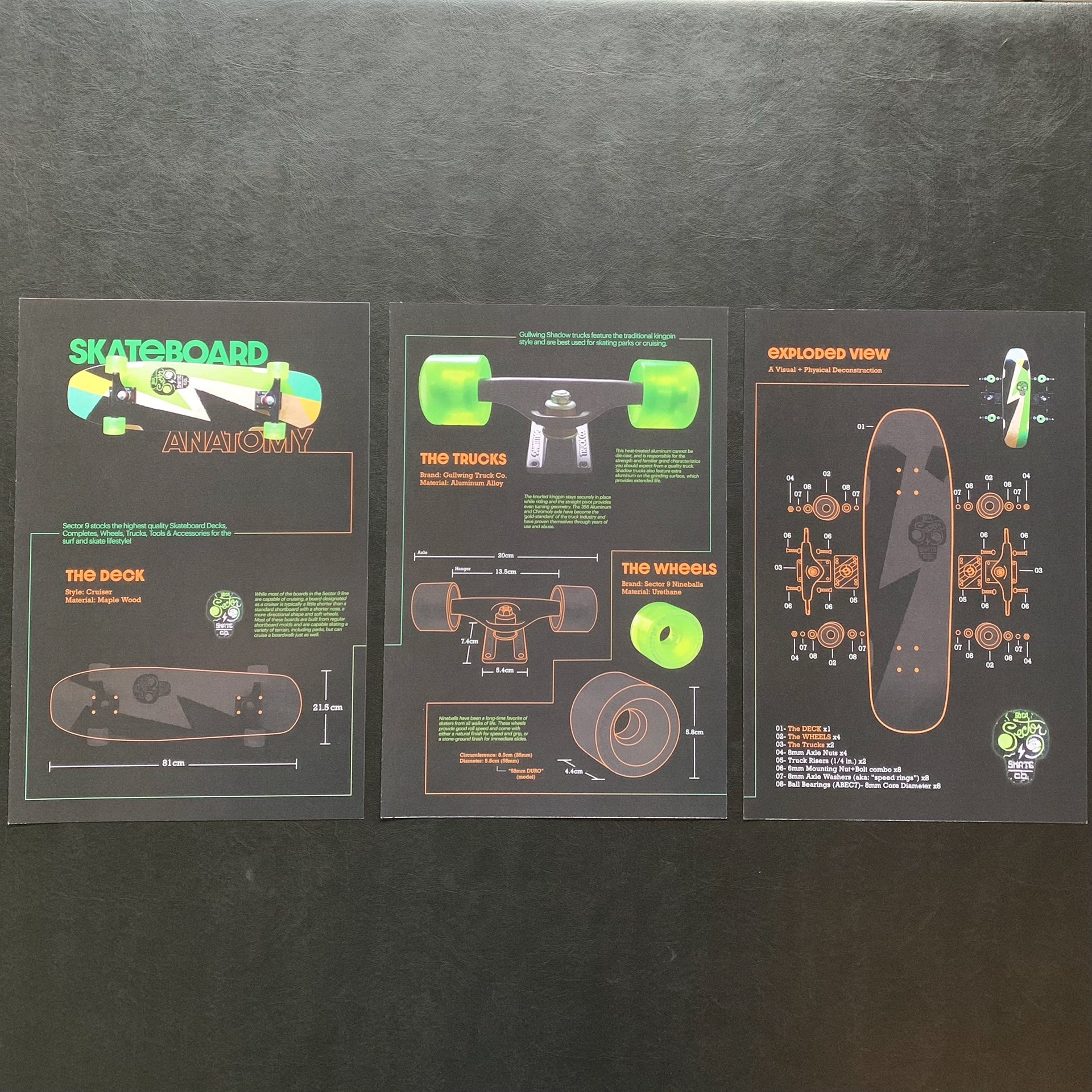
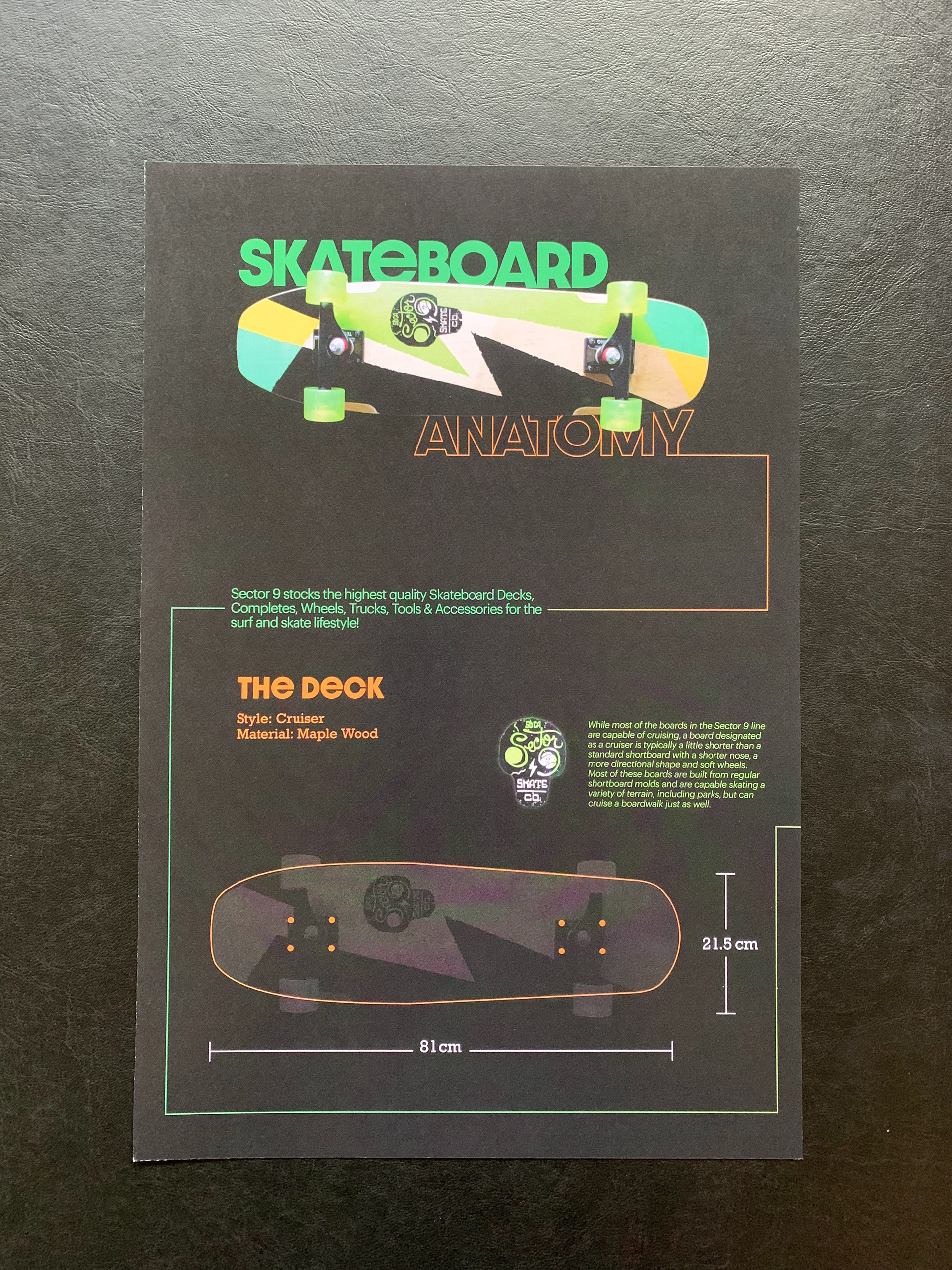
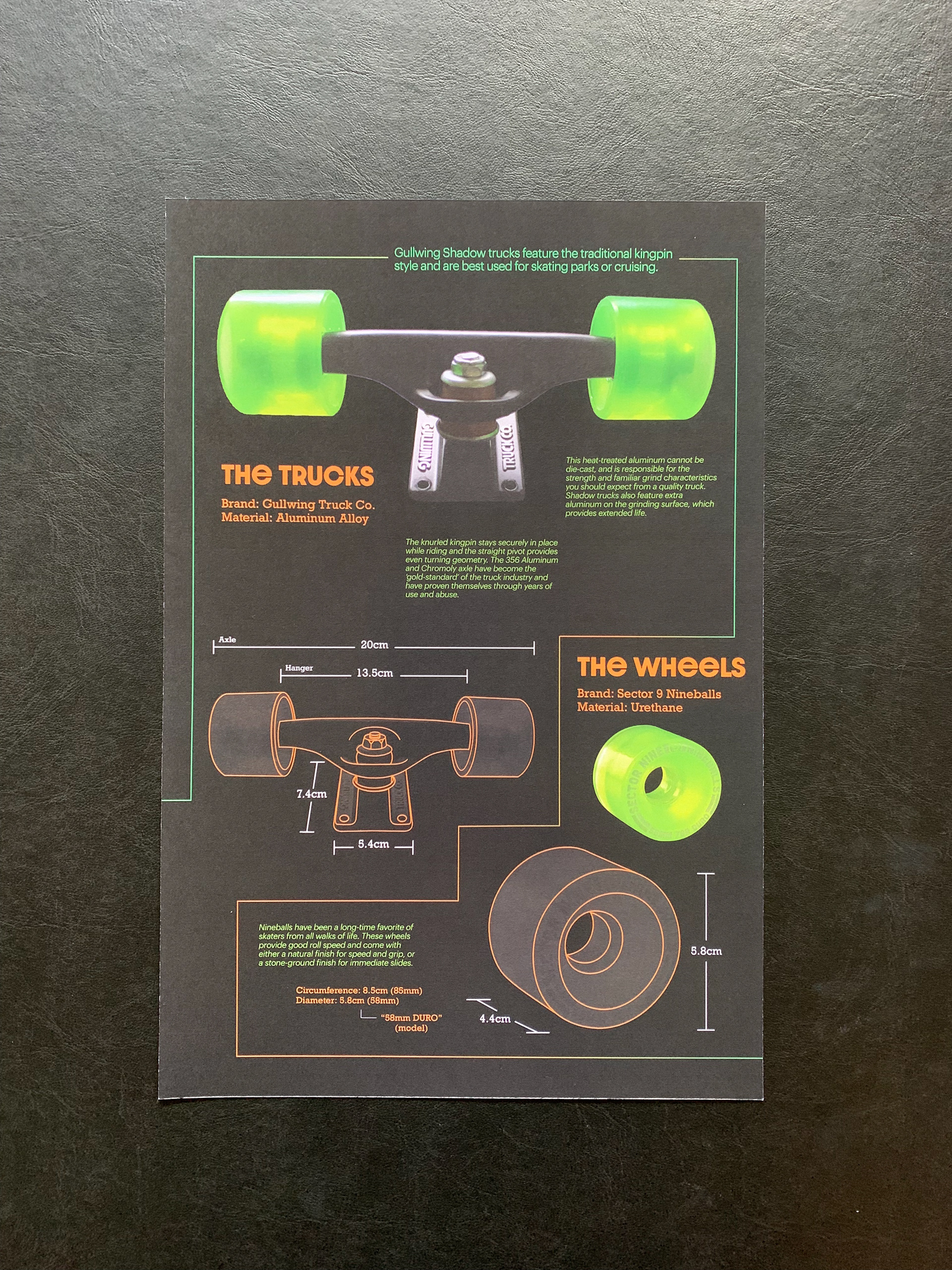
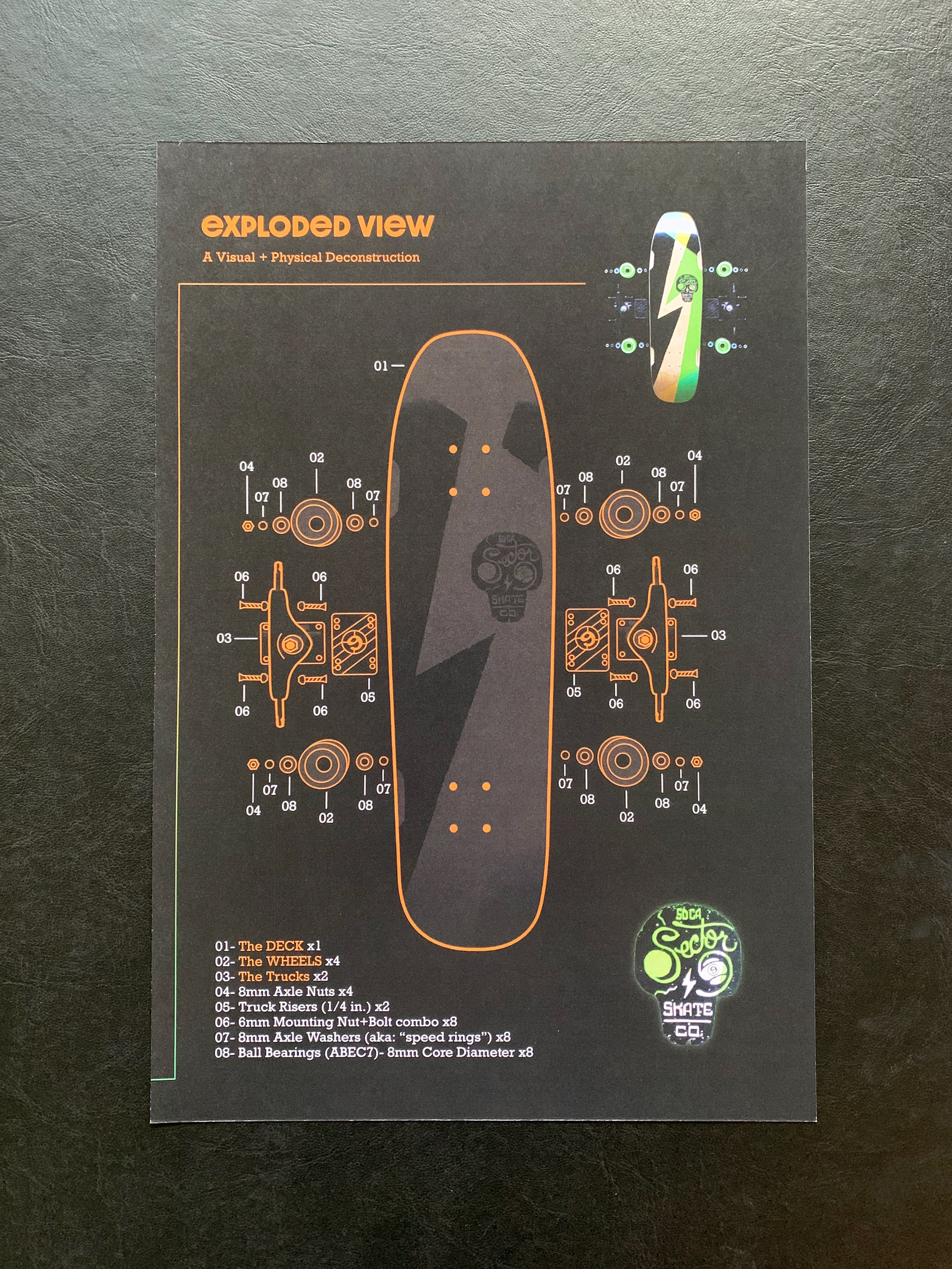
My concept became one that envisioned shopping online for a new skateboard, and when receiving it in the mail, it comes with print-outs of the the skateboard’s specs in a collectible 3-poster series.
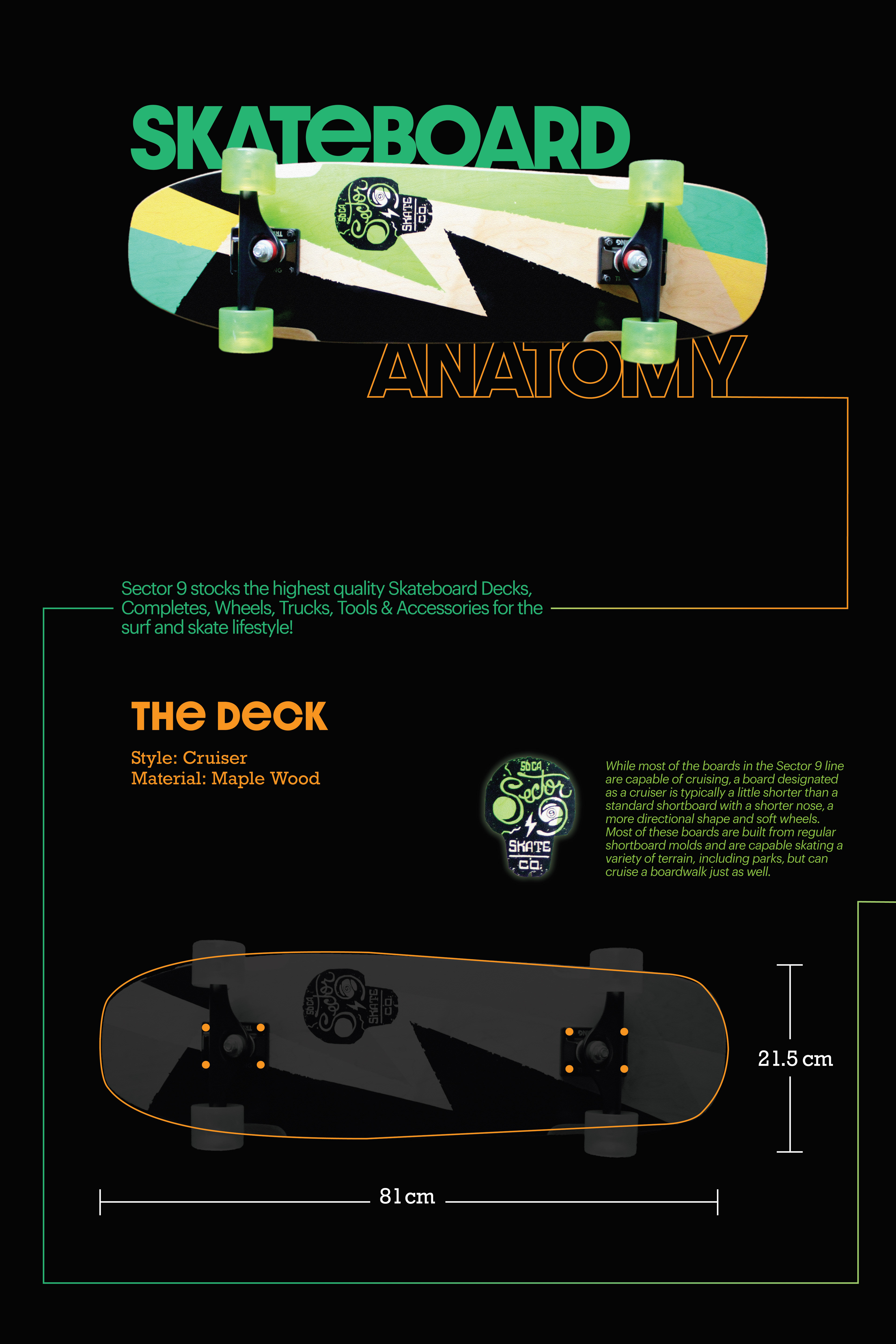
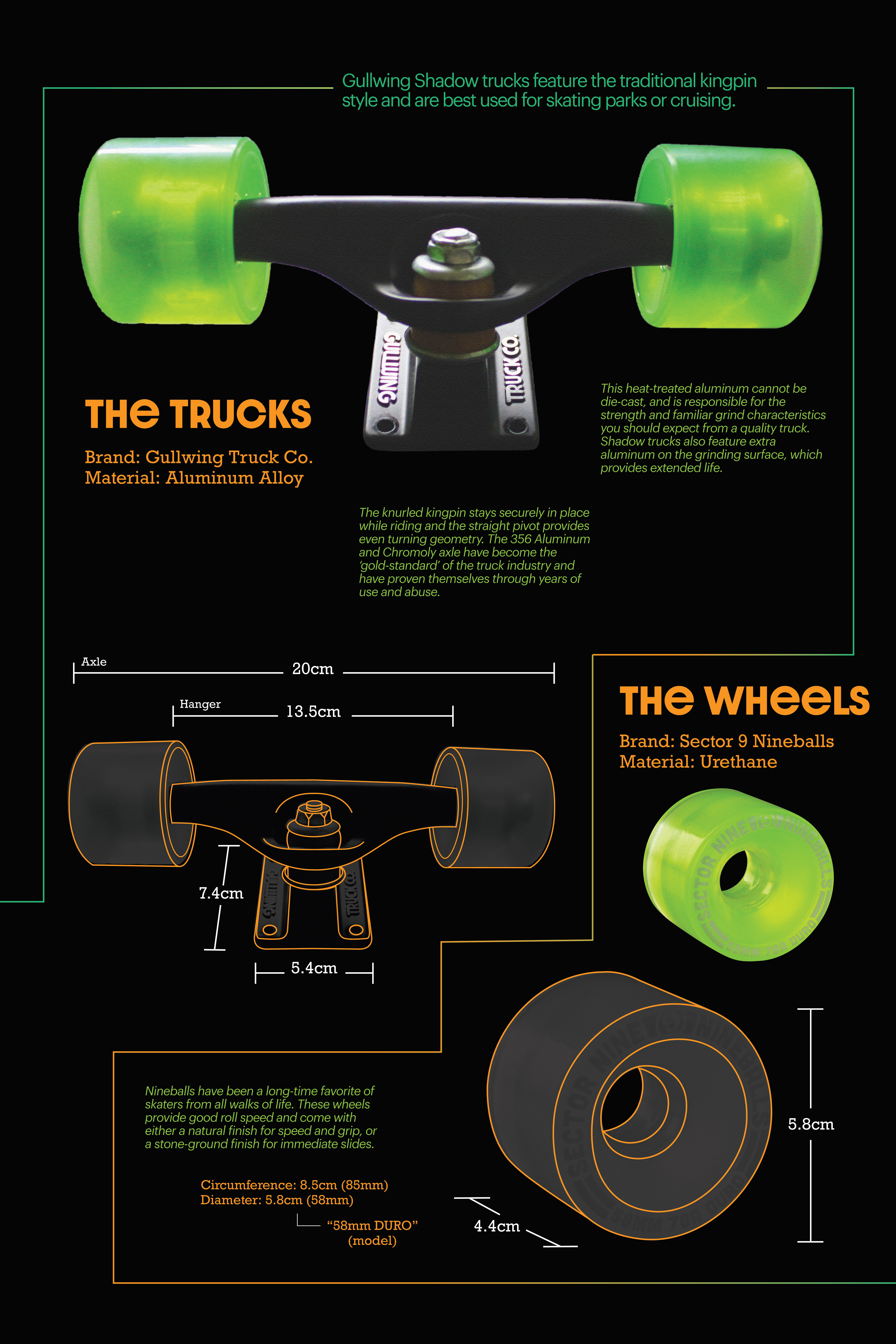
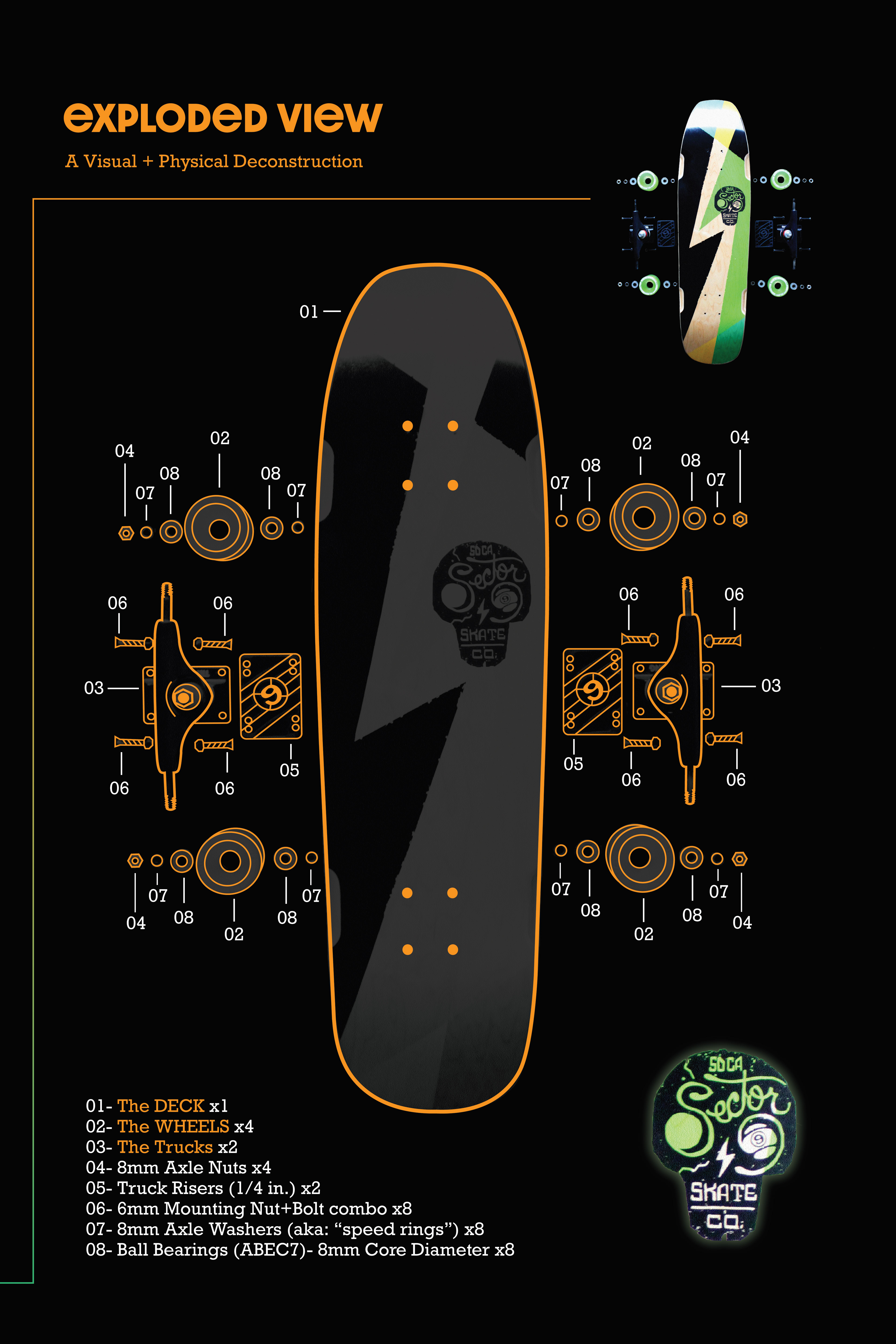
Research involved dissassembling, measuring, and photographing my actual skateboard myself. I edited my images for color-consistency and styling. I illustrated all of the lines in a blue-print style and superimposed them over the top.
I structured my posters for print first, and built my web interface design off of that. The finished work includes a printed 3-poster set and a printed UI/UX Web interface story-board to show my concept for real-world application.
I chose orange and white colors to use because they corresponded and contrasted relly well with the greens and yellows of the actual board.
I used a fat display typeface, Dazzle Unicase, to bring in an extreme sports vibe, bold and energetic, and with round forms, like wheels. I paired it with Graphik, a nice sans that compliments the roundness of the Dazzle Unicase forms. And I used a slab-serif, Rockwell Nova, for the technical specs because it’s stroke weight holds up well with the others.
Overall very proud of how this turned out. I could see it in use online!